The Jedi Dashboard: Mastering Operational Efficiency
Enhancing Program Managers' efficiency and bandwidth through a unified dashboard, enabling them to handle more learners with the same effort and significantly reducing delivery operation costs.
Overview
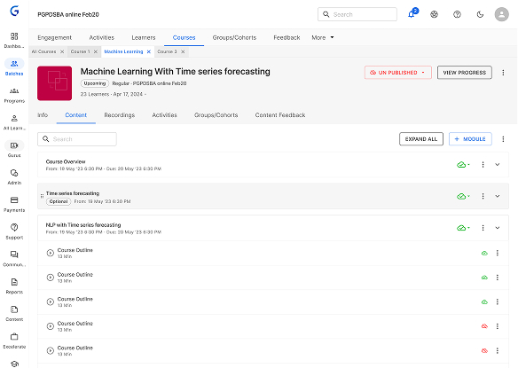
The Ninja Olympus platform is a dynamic Learning Management System (LMS) that orchestrates diverse learning activities. While Ninja is a vital tool, we operate on the principle that evolution leads to greatness.
The primary goal of the Jedi Dashboard initiative was to enhance Program Managers' (PM) efficiency and bandwidth, enabling them to handle more learners with the same effort and significantly reducing delivery operation costs.
High-Impact Achievements Redefining Operational Scale
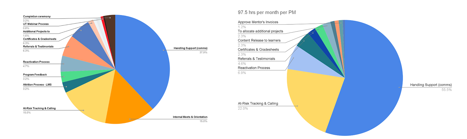
- 80% increase in learner handling capacity per PM, from 100–120 to 200 learners per PM.
- Reduced ticket resolution time and improved planning & communication visibility.
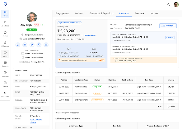
- Achieved full auditability by logging emails, calls, and WhatsApp interactions.
- Implemented tools for tracking learning and financial commitments.
- Enabled strategic actions through segmented learners, one-click actions, and follow-up reminders.
The Process: A Structured Approach to Design
A consistent, structured design process was followed for optimal results:
- Research & Discovery: Understand project requirements, goals, audience, and trends.
- Ideation & Conceptualisation: Generate ideas, create sketches, and explore possibilities.
- Design Development: Refine concepts, create mockups, and iterate based on feedback.
- Feedback & Iteration: Gather stakeholder and user feedback for improvements.
- Finalisation & Delivery: Polish designs and prepare for implementation/presentation.
Phase I: Research & Discovery
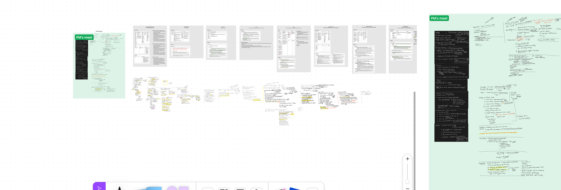
Conducted interviews with 20 Program Managers, 5 BU heads, and Senior PMs, alongside a broad quantitative survey.
Core Challenges Identified
- Scattered communication and disorganized learner follow-up history.
- Incomplete logging of key actions, making reporting difficult.
- Lack of visibility and forecasting across teams.
- Manual workflows and no automation for critical segments (like "at risk" learners).
Discovery Insights by Process Area
- Support Tickets: Automation and small tweaks can drastically reduce turnaround time.
- Content Importing: Process optimization can save time and enhance UX.
- Session Planning/Deletion: Simplification reduces errors and scheduling issues.

Discovery Insights
Discovery: Support Ticket
What We Did
- Observed PM ticket resolution workflow.
- Conducted interviews to understand challenges.
- Collected feedback on key pain points.
Key Observations
- Resolving tickets within TAT is a core KRA.
- Process can be improved at multiple steps.
- Automation and small tweaks can enhance UX and reduce closing time.
Discovery: Content Import
What We Did
- Observed PM content import process.
- Held interviews to gather usability insights.
- Mapped key friction and inefficiency areas.
Key Observations
- Content imported weekly/daily, but flow is not user-friendly.
- Optimization can save time and improve efficiency.
- Small UX tweaks can greatly enhance usability.
Discovery: Session Planning / Deletion
What We Did
- Observed daily and weekly session workflows.
- Connected with PMs for feedback and validation.
- Identified recurring issues in scheduling and accuracy.
Key Observations
- Process is complex and overwhelming for PMs.
- High risk of scheduling errors.
- Better workflow design can reduce manual mistakes.
Key Research Findings
- Context, communication & follow-up history for learners were scattered.
- Actions taken were inconsistently logged and tracked.
- Missing data made it difficult to report progress effectively.
- Lack of visibility hindered forecasting and scalability.
- Teams faced challenges in aligning workflows efficiently.
- Automation gaps existed for segment-specific workflows (e.g., "at risk").
Phase II: Ideation & Conceptualisation
As part of this initiative, we have identified key areas of focus. The larger team has agreed to categorise tasks into two types: those related to communication and those not related to communication:
Strategic Areas of Focus
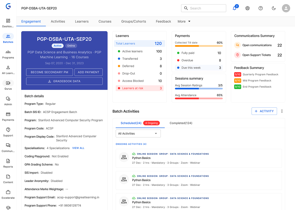
Dashboard Views
Added learner, batch, and global views to simplify daily PM tasks.
Communication Sync
Built email sync and tracking for seamless PM-learner communication.
Data & Tracking
Gathered activity data at multiple levels for actionable insights.
Mobile Access
Created a future-ready Jedi mobile app for on-the-go PM monitoring.
Alerts
Introduced real-time notifications and alerts for proactive support.
Specific Design Goals
Simplify
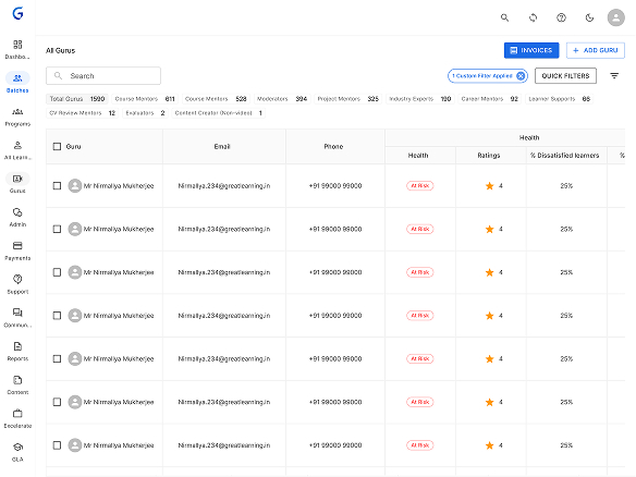
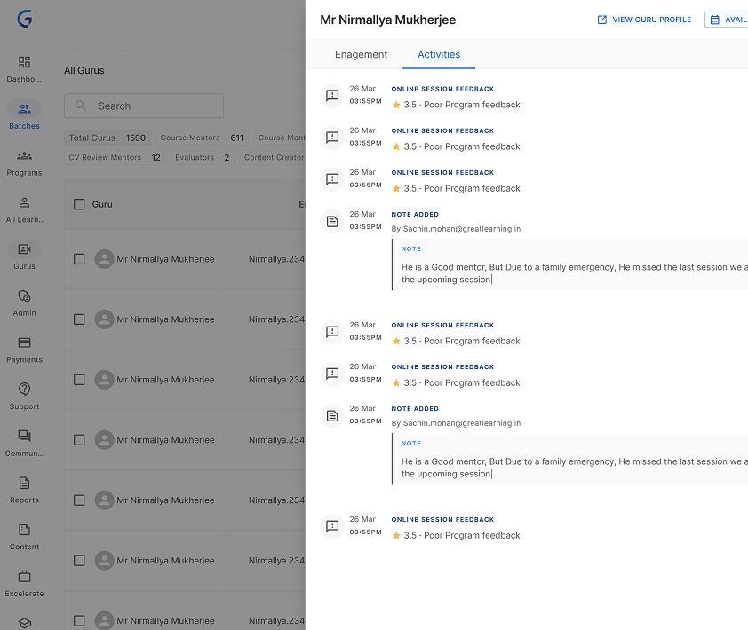
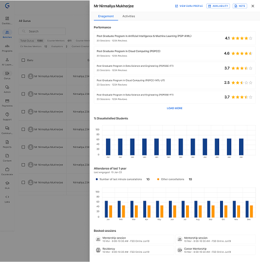
Introduced 360° learner view with history, activities, and intuitive navigation.
Track KRAs Easily
Added engagement sheets, filters, and progress tracking for key metrics.
Enhance Clarity
Standardized logging and visual insights into learner and financial data.
Automate
Enabled segmentation, bulk emails, and automatic follow-ups.
Phase III & IV: Design & Development, Feedback & Iteration
After gathering feedback from key stakeholders, we have chosen to utilise MUI.com as our frontend platform. This decision is based on its use of material library components in React and its reputation for reliability. So we've setup a library with material design components it helped us to speedup the development process and Design process. Because of the availability of components not only for Designers it is available for Developers.
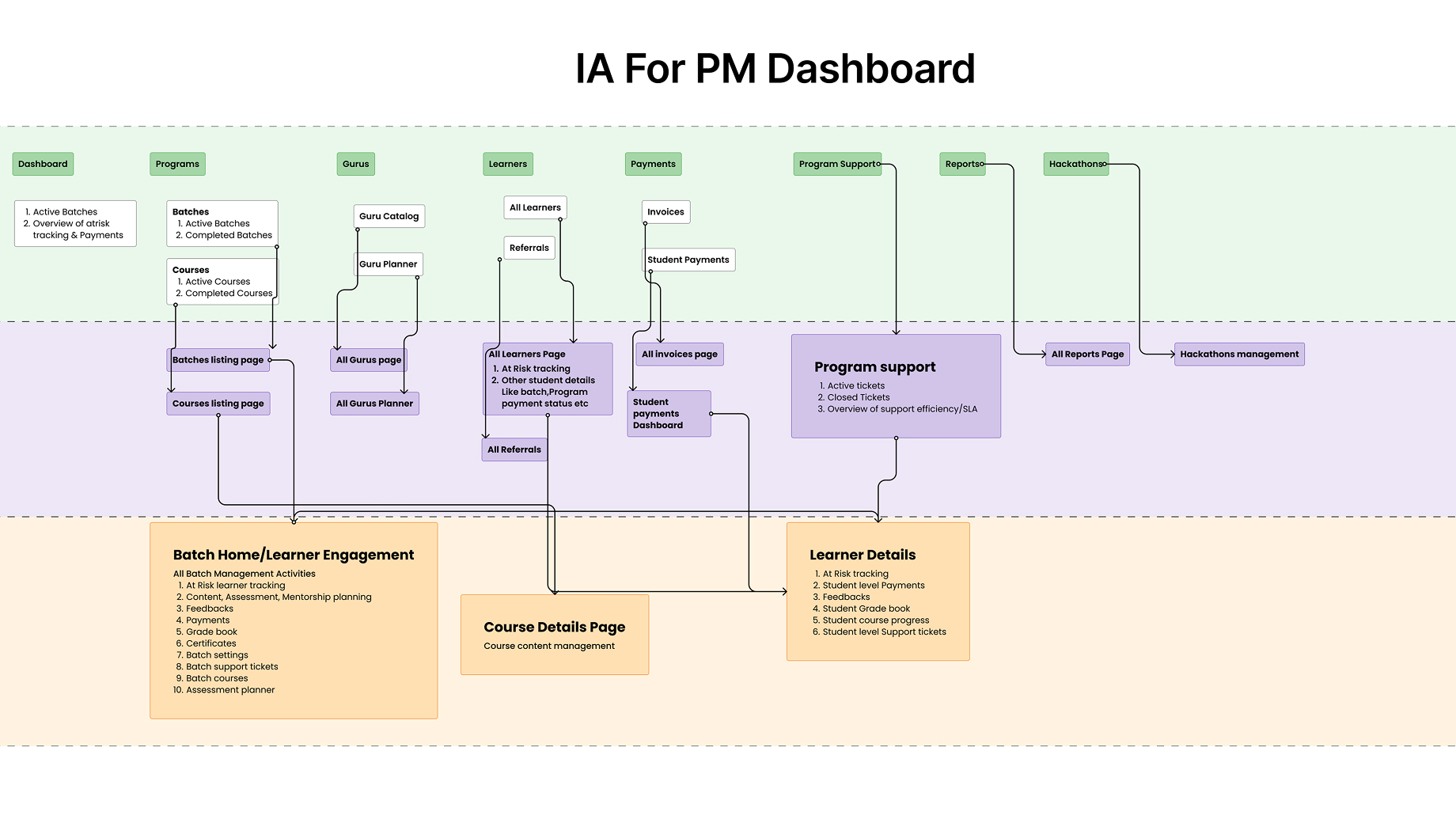
Information Architecture (IA)
Lo-Fi Designs
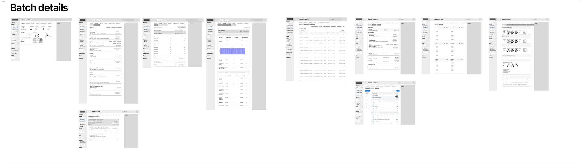
Hi-Fi Designs
Feedback & Iteration
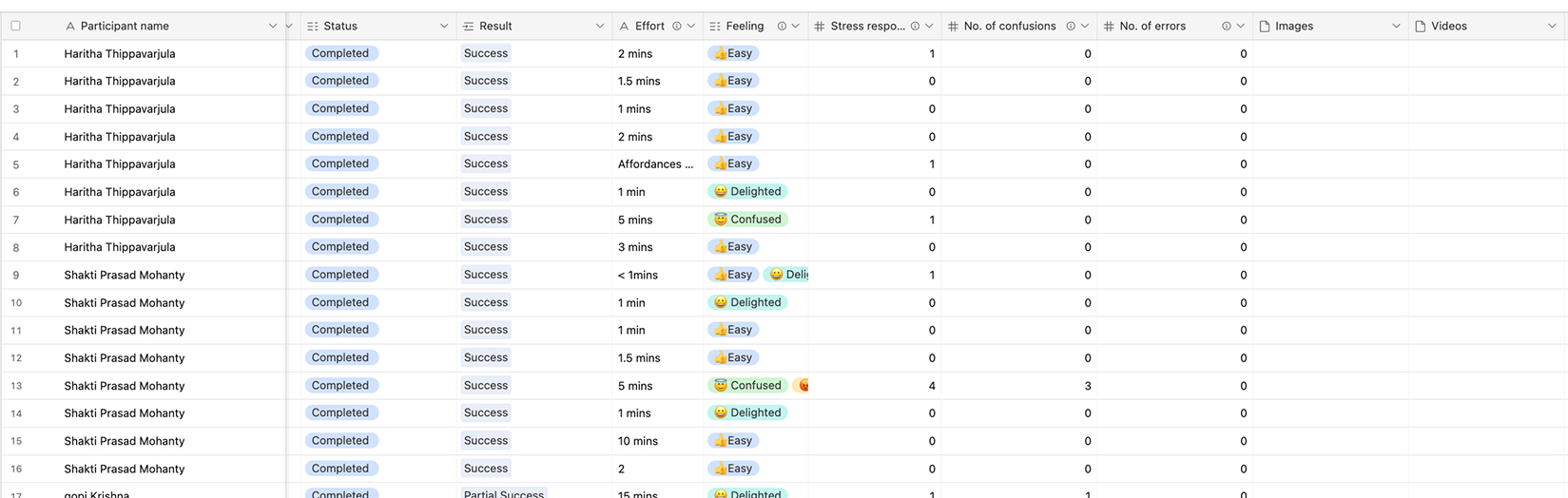
Before the release, we conducted a comprehensive usability test and gathered feedback from stakeholders. While the findings were satisfactory, I identified several areas for improvement. One of these areas was the heavy font sizes in the data tables, which stemmed from user preferences. PMs wanted to view more data within a single view. Additional usability refinements were also identified to improve overall efficiency and data readability.
Usability Testing: Comprehensive testing revealed a need to optimize table readability, leading to refined typography and spacing for data-dense screens.
Phase V: Finalisation & Delivery
The release involved collaboration with experimental teams to assess PM performance improvements. Early feedback prompted the creation of Quick Filters for faster task access.
Tracking over three months confirmed the 80% efficiency improvement, validating the system's success and enabling scaling to 200 learners per PM.